Maybe it’s time we re-think docs
GitHub Docs are open source, and you can contribute to the project by visiting the GitHub repo.
You’ve probably heard something like this before, “documentation isn’t a priority, can’t we just copy and use what someone else has built and call it done?” Docs are often an after-thought, not only in feature implementation but also in writing and curation. The truth is that documentation can make or break someone’s success with your software. Often, developers form their first impressions through docs, even before they make it to the product. Bringing documentation to life with a personalized engaging experience can be the antidote to stale, esoteric docs. Build docs that act as the butler to your product.

From static and stale, to engaging and interactive
Today, too many documentation sites are static, out-of-date, and lifeless. They aren’t thought of with the same care and detail as the core product, even though they often are a core product. The reader is expected to do too much work, open tab after tab, search endlessly and scroll through verbose articles just to find a simple code example.
Wouldn’t it be great if the docs knew that you were writing a Python app on a Windows machine and that you preferred watching videos instead of reading through text? I want you to find the answer to your questions in the docs, easily and efficiently. When you’re stuck on a problem and you turn to the docs, there’s a moment of magic as you find the solution, try it out and it works. In that moment you become unblocked, you learn something new and you can move on to keep building your application.
Over the past year, I’ve spent time with our documentation team at GitHub where we have been working together to understand the challenges that developers face with documentation today. We want to build an experience that works better, inspires more, teaches instead of assumes, confuses less, and is personalized to your needs as a developer. Together, we learned a few key things that have helped us understand some of the pain developers face with documentation every day:
- People have a hard time finding what they need: Documentation is not linked from the right places in the product.
- Support teams rely on a knowledge management system (KM) that duplicates the docs instead of referencing them — focusing on content storage, retrieval, and assessment (instead of end-user success).
- Developers learn different things in lots of different ways — tutorials, videos, examples, guides, etc. Docs today mostly offer static content with code examples that aren’t interactive.
- People use search as a way to navigate, and they often lose the search UX when they’re deep into an article.
- When developers get stuck, they want to ask other developers questions & get an answer from their peers.
By the way, if we solve for these pain points, not only are we making the experience of reading and interacting with the docs better, but we’re also able to improve the experience of writing the docs. If you’re lucky to have an amazing group of technical writers, like we do at GitHub, it’s important to take advantage of their deep knowledge of the product and give them the tools to write great docs. We open sourced the entire GitHub Docs application in October of 2020, this includes the content, the code, and even the process for authoring articles. With a system that’s authored in a collaborative, immersive way, we have to build a user experience to match.
Some guiding principles
After talking with hundreds of developers, learning what they were struggling with, and what they wished for, I wrote up a few principles. The intent was to have something to lean on, that I could use as I brainstormed ideas that may solve some frustrations developers have with documentation.
- Lead with code: Developers want to write code, give them the code examples as starting blocks. Don’t bury the lede.
- Solve the problem (aka: answer the question): Developers come to docs to learn the answer to a question, challenge, or problem they’re trying to resolve. Give them the answer through multiple methods (video, text, tutorials, guides, etc.), so they learn the solution in a way that works for them.
- Enable community: Embrace the fun of collaboration, the support of the community, and empower people teaching people.
- Meet user's needs: Docs should never be optimized to result in a support ticket, we don’t funnel devs to open tickets, we ensure our content meets the user’s need.
- Encourage contribution: Open source — anyone should be able to contribute to docs & help improve the content.
- Keep docs fresh: Software changes, so should the docs! They should feel alive, fresh, and relevant.
- Refine and simplify: Simplicity is hard to achieve, we consistently refine and simplify our platform and access to content — minimize the clicks to content.
- Measurable success: We are actively measuring if our content successfully meets users’ needs and consistently improves its efficacy.
- Encourage play and experimentation: Developers come to docs to do many things, let them discover and engage creatively through playing around. “Try it yourself!”
- Medium agnostic & portable: Developers should be able to call docs from wherever they are, like their terminal or their IDE. Code examples should be easy to take with you and re-use.
Brainstorm and sketch
This next part is a little peek into the brain of a product person. What follows are a series of ideas — some of these are provoking actual improvements to GitHub’s docs, but I use them as a way to spark curiosity and generate ideas for how we can build better docs for developers in general.
My goal with these sketches was to set a direction for how we can take docs into a more community-driven, developer-first, extensible & interactive, engaging world. The idea is that they’re medium agnostic (devs can call docs from wherever they are), they’re open source (anyone can contribute to the docs easily, which will mean updating our publishing process), and they’re content as software (we treat the content like it’s part of the software development process, not secondary to it).
I wanted to move from a system that focuses on the brevity of our content platform to one that also highlights the intent behind what the developer is trying to do. When you look at other learning and content systems like Stripe, Twilio, or Circle CI, they structure the content around intent models. “Get started with Stripe’s API”, for example, pinpoints the intent of the content upon entry, which puts the power into the hands of the developer as they explore and learn.
These sketches are designed to help our users get to the right place faster, and force us as curators to think about what the reader is trying to do — we can structure based on intent, instead of brevity.
Finally, they introduce a system that we can expand on as we explore and start building against it. So, there are a few things that I intentionally didn’t focus on, but we’ll need to address at some point because they’re important:
- Mobile views
- Reference a doc from within another GitHub property (github.com, community forum, etc.)
- A more fun, and intuitive home page
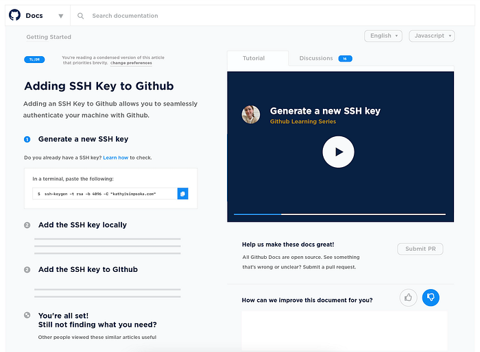
A new tutorial/guide page
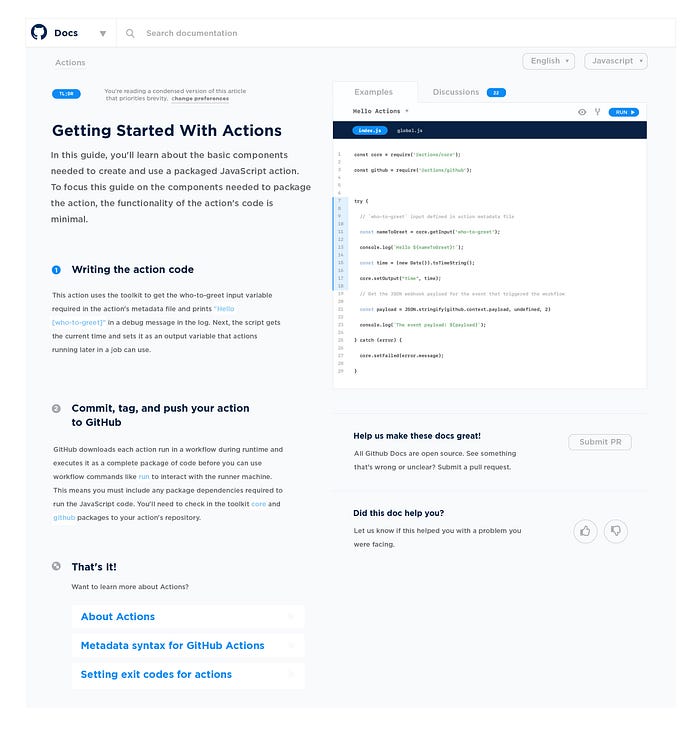
I started with the article page for a tutorial or guide. I picked it first because developers often end up looking at these pages before they see any other part of the site and that’s thanks to referral links and Google search.
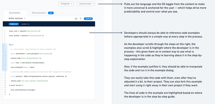
The idea behind this page is to get the reader into the content as quickly as possible so that they can experiment and try things themselves. The page is broken down into three parts: the left rail that walks through the tutorial steps, the right interaction box that highlights code examples, and the bottom which tells you where to go next and if you’re feeling generous asks for feedback. The most important part of the page: the interaction.
Here’s how it works.
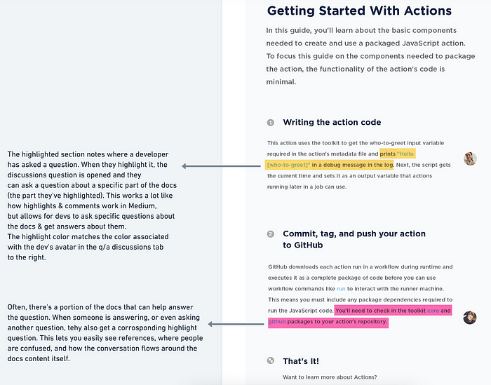
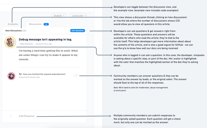
A place to have a conversation
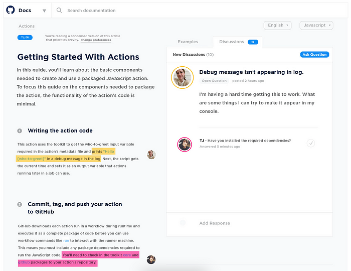
Developers I talk with about documentation always tell me that they primarily learn from each other. Sometimes it’s through code review, other times it’s from googling and reading through other developer’s examples. Taking this feedback to heart, I decided to play around with what it might look like to have a conversation about the software or code from within the documentation itself.
Here’s how it works:
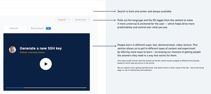
Learn in more ways than one: adding video
Docs are about learning and people learn in many ways. The idea that you learn in only one way has always seemed a little bananas to me. Sometimes I’m an audible learner, sometimes I’m visual. Embracing that, and the desire to make the docs come to life a little bit, I decided to add some video.
This page works similarly to the article/tutorial page that uses code examples. If you’d rather watch a video about the content, then click the video tab and press play. The video will show you a developer walking through the steps in the content on the left rail — and as you scroll, the video will advance to that part of the tutorial.
Here’s how it works:
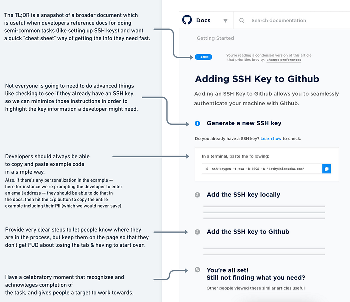
And because SSH is a bit of a white whale for documentation (it’s the most visited article page for docs.github.com), I decided to explore a bit more about what would make the SSH article a little more friendly, but these layout options work for any tutorial. Here’s what that looks like:
Finally: Search and navigation
Search and navigation are often one in the same for content sites, but the UX is driven by intent.
Let’s start with navigation. To make sense of the breadth of content on the GitHub documentation page, we organize things into categories. However, category bloat happens when there are too many choices for a user to think about. This is the ‘soup aisle conundrum,’ which can of soup do you choose when you have over 100 options? The choice becomes so overwhelming that the customer eventually gives up. To combat category bloat, we curate what we serve to the user (we can lean on the search features to allow readers to navigate with more precision). When we curate aggressively we increase the precision and accuracy of our content. This helps get our users to the right place faster, and forces us as curators to think about what the reader is trying to do — we can structure these categories based on intent, instead of content brevity.
Because navigation is a cornerstone for the site, I wrote down some rules for this sketch:
- Organize content based on so that navigating to the right content feels effortless.
- Make text legible.
- Be simple, predictable, and consistent.
Here’s how it works:
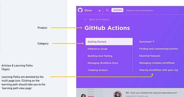
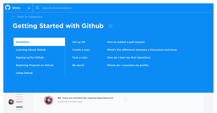
Navigation hierarchy works in cooperation with content hierarchy. Products are top-level, categories are curated based on intent, topics organize articles within a category and articles teach concepts in a topic. What you see above is an example of how the navigation fluctuates as you dive into a product area. Since there’s more than one product, we need a view for that, too.
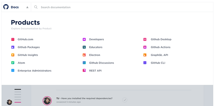
As you’re exploring the site, use the navigation (this mega menu) to keep you oriented and find new things. What I’ve learned from watching developers use docs.github.com, and from the usage data, is that people typically stay within one product area — they don’t often explore across products during the same session. But if you wanted to, we need to make that kind of behavior easy, because the docs navigation is part of the way people discover new GitHub products!
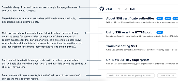
Now onto search. Search is a way to navigate with more precision (as opposed to browsing). You have an idea for what you’re looking for, and you want to search for the answer. For example, if you’re like me you constantly forget how GitHub SSH works, so whenever you need to use it you search for the SSH article. Search is also a cornerstone to the entire site experience, so it should be front and center.
Here’s how it works:
Find your answer, faster
The entire motivation for exploring these sketches is to build a doc experience that meets developers where they’re at. Docs.github.com can do a better job of organizing the content, giving you new ways to access it, and customizing a reading experience that is designed for you. Developer documentation is part of the product, an extension of the application, and a part of the code. Without it, people can get lost, so it’s important to give waypoints and that’s what this system is intended to provide. The more magic “aha!” and “it worked!” moments that we can inspire through documentation, the more we’re unlocking a path for people to be creative, productive, and get back to the business of coding.
If you think that documentation sites don’t need to be prioritized or that we shouldn’t invest in them, just ask a developer what they need, and then go think again about what you might be missing out on if you don’t have an immersive, interactive and engaging experience for docs. Instead of just making Yet Another Docs Site (YADS), let’s make experiences that stands apart — our developers deserve it.